
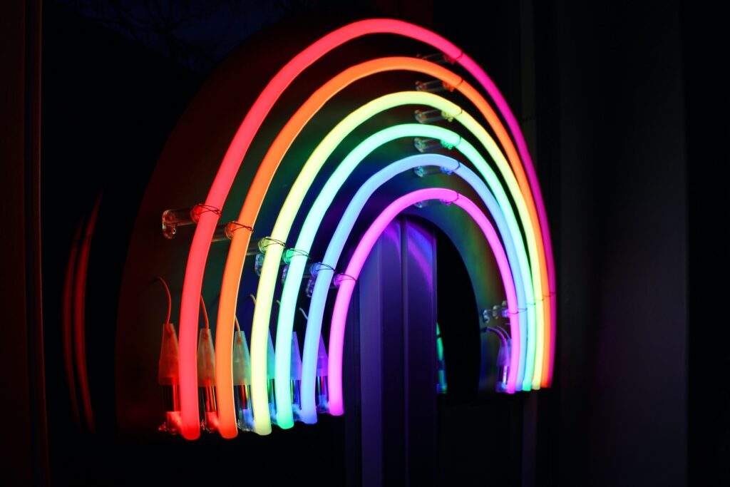
Seeing rainbows in so many windows, made me think about the importance of colour in branding and marketing.
Colour Psychology is simply the effect colour can have on behaviour. The use of colour has a massive impact on mood and emotions. Colorcom research shows consumers “make a subconscious judgment about a person, environment, or product within 90 seconds of initial viewing and that between 62% and 90% of that assessment is based on colour alone.” (https://www.colorcom.com/research/why-color-matters) We associate different colours with specific feelings and as such companies need to think carefully about which colours they want to use in their branding.
The below list the attributes most commonly associated with various colours.
Rainbow Colours
Red is an attention-grabbing colour which is known to encourage appetite. This is why you’ll find it at many fast food restaurants. In addition, it is great for call to actions as it prompts a reaction.
- Passion
- Energy
- Confidence
- Heat (both negative & positive connotations)
- Anger
- Danger
- Sense of urgency
Orange is a friendly and cheerful colour often associated with feelings of warmth. Great for budget travel companies targeting the younger generation (think EasyJet ?)
- Youth
- Warmth
- Affordability
- Vitality
- Friendliness
- Seasonal changes (particularly summer into autumn)
Yellow is associated with happiness and energy. However, it does have different connotations globally and is also associated with caution and fear.
- Energy
- Optimism
- Happiness
- Youth
- Caution
- Cowardliness
Green is always going to be associated with nature and health. It is the perfect choice for health foods, eco-friendly companies and health retreats
- The environment
- Health
- Luck
- Growth
- Wealth
- Harmony
- Balance
Blue is great for companies that want to communicate authority and stability such as banks and legal firms. It would also be ideal for spas to use within their brand to convey tranquillity & relaxation.
- Calmness
- Refreshing
- Responsibility
- Authority
- Peace
- Relaxation
- Sadness
Purple is associated with wealth and royalty as well as mystery and magic. It is an ideal colour for Investment Houses targeting HNWI.
- Royalty
- Luxury
- Magic
- Mystery
- Wealth
- Spirituality
We all know pink is used a lot more for girls (rightly or wrong). It is associated with all things feminine. Commonly linked with creativity and fun, pink could be perfect for a graphic designer.
- Fun
- Girly / feminine
- Upbeat
- Creativity
- Sweet
- Romantic
- Peaceful
Other Colours
Grey is mainly associated with efficiency and function. Think high end Scandinavian interior designs. However, be careful not to be boring. Grey is best with an exciting accent colour
- Neutral
- Professional
- Efficient
- Minimalist
- Calm
- Timeless
- Boring
Black is super cool and of course luxurious which is why so many luxury brands use it. Black is also associated with mourning and death so companies should take that into consideration when picking this colour.
- Luxury
- Mystique
- Power
- Formality
- Elegance
- Darkness
- Death
White is synonymous with simplicity and purity. If you’re going to use white you need to keep designs simple and clear (think Apple).
- Cleanliness
- Purity
- Simplicity
- Youth
- Peace
- Blandness
- Coldness
Brown is a rustic colour you can trust. It’s great for rugged ‘outdoorsy’ companies as well as being prevalent in food branding, especially coffee and chocolate!
- Reliable
- Old-fashioned
- Earthy
- Masculine
- Warmth
- Wholesome
- Nurturing
Final thought
Whatever colour pallet you choose, it is important to make sure it translates across all of your markets. This is very important if you’re a global brand. For example, in many countries purple is associated with royalty, yet in Brazil it is associated with death. Yellow represents envy in Germany, bravery in Japan, cowardliness in many parts and death in Latin America. White signifies purity in the Western Hemisphere. Whereas in many Asian countries it signifies death and bad luck.
Of course, these are generalisations, colour perception is largely subjective. Similarly, different tones of colour will evoke varying feelings as will using multiple colours together. In conclusion, if you have a colour scheme you like and want to use it in your branding go for it! It is likely that other people will like it too.
Be careful if you’re colour blind though! It might be worth getting a second opinion!
Comments are closed